
2026-07-31
Where to put chat and forms on a product site (page by page)
Chat on every page is noise. Forms only on /contact is a missed sale. Here is a simple placement map for product, pricing, docs, and blog pages.
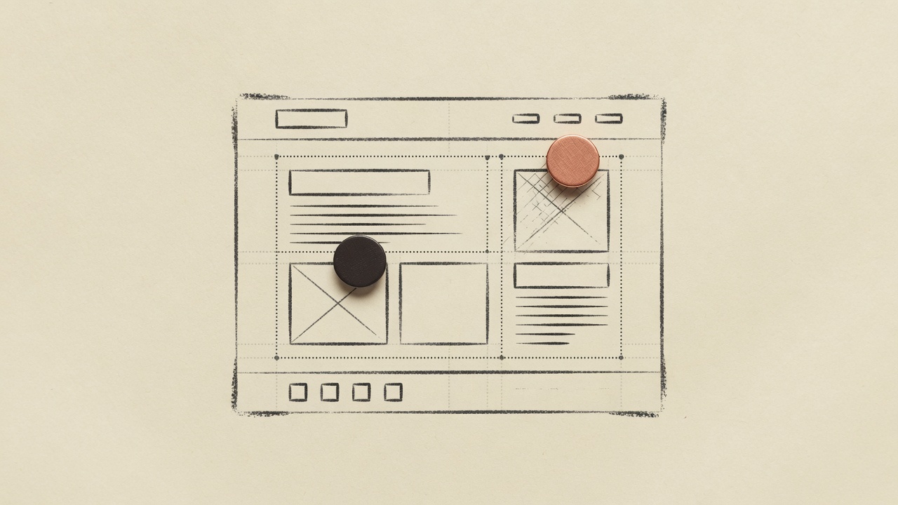
Placement is strategy, not decoration
You already know when chat beats a form and when a form wins. The next question is spatial: which pages get which tool?
Wrong placement looks like:
- Chat bubble on the legal page that nobody needs
- No form on pricing when every visitor has a "custom" question
- Blog posts that never invite feedback
- Contact page with a naked mailto: and nothing structured
Right placement feels quiet. People get help where they are stuck, and operators get tickets that mean something.
A simple map (steal this)
| Page type | Chat | Form | Why |
|---|---|---|---|
| Homepage | Optional, soft | Rarely primary | Browse first; do not ambush |
| Product / features | Yes | Secondary | "How does this work?" lives here |
| Pricing | Yes | Sales / demo form | Money questions + high-intent leads |
| Docs / guides | Yes | Support form if stuck | Deflect with answers; escalate cleanly |
| Blog / field notes | Light | Feedback optional | Readers, not always buyers |
| Contact | Optional | Primary | Structured capture is the job |
| Login / app | Careful | Account-aware paths | Avoid confusing logged-out vs in |
DeskQ lets you limit chat pages and origins in desk settings, and drop form.js only where you want it. One desk, two embeds, different surfaces.
Homepage
Goal: explain the product, not run a helpdesk.
- Prefer a clear CTA to try or sign up
- Chat can exist if your audience expects it — keep the greeting calm
- Do not force a long form above the fold
If you dogfood like DeskQ's own site, chat can sit quietly while the page sells.
Pricing
Goal: remove purchase friction.
Chat should answer:
- What is included on Free vs paid
- Seat / desk limits
- Cancel anytime?
Form should capture:
- "Talk to sales," custom volume, partnership
Link both to real plan language — DeskQ pricing is the pattern: numbers first, FAQ second.
Product and feature pages
This is where product-trained chat earns its keep. Visitors ask specifics. Your FAQs and page copy should already hold the answers.
Form: only if the page's job is conversion (book demo, join waitlist).
Docs
Chat is a second search. When docs fail, offer handoff — AI to human ticket with context.
A support form with "URL of the doc page" and "what you expected" fields is gold for operators.
Blog
Readers are not always ready to buy. Options:
- Soft chat greeting for feedback on the post
- Footer CTA to start free or try a tool
- Occasional feedback form, not every paragraph
DeskQ's public blog uses a conversion bar; chat can be path-aware. Do not turn essays into spam.
Contact
Make the form the hero. Tags, priority, the fields you need. Chat can still answer "are you humans?" before they submit.
Technical notes that save headaches
- Allowed pages / origins — keep widgets off internal apps you do not want public
- Host-adaptive look — widgets should match the brand so placement feels native
- One inbox — so pricing form leads and docs handoffs are not two tools
- Try before install — tools if you want to stress-test questions without shipping UI
A 30-minute placement audit
- List top 10 entry pages from analytics
- For each: job of the page (learn / buy / fix / contact)
- Assign chat / form / neither
- Install only what you assigned
- Review tickets for a week — wrong page? move the embed
Bottom line
Chat everywhere is a cry for help. Forms nowhere is a silent website.
Map page jobs, place tools accordingly, train from the URL, and let tickets land in one place. That is boring. Boring ships.